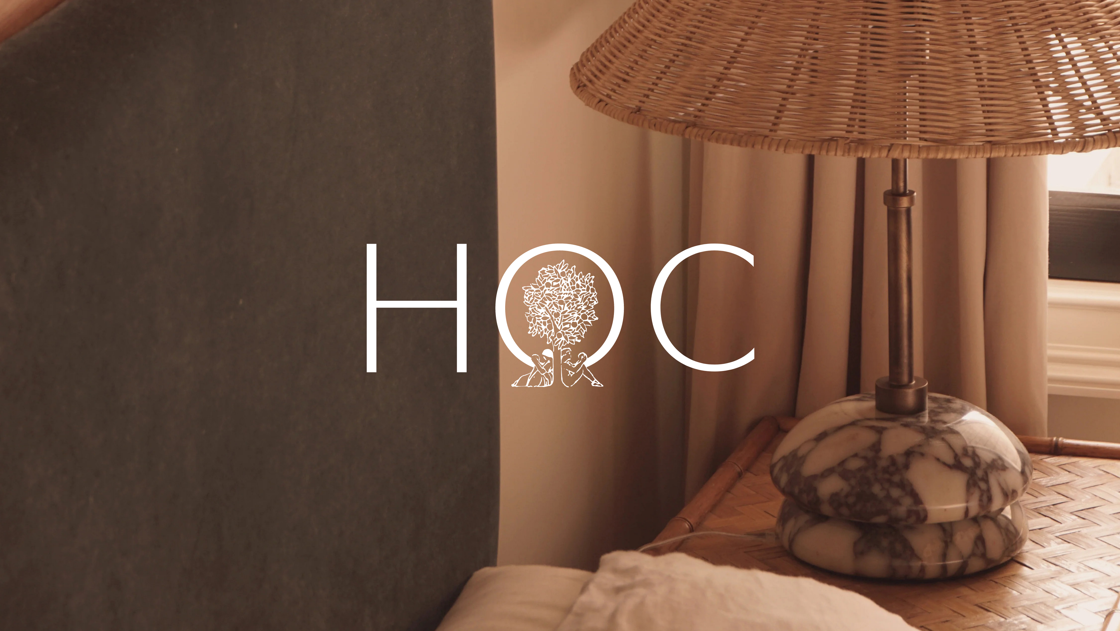
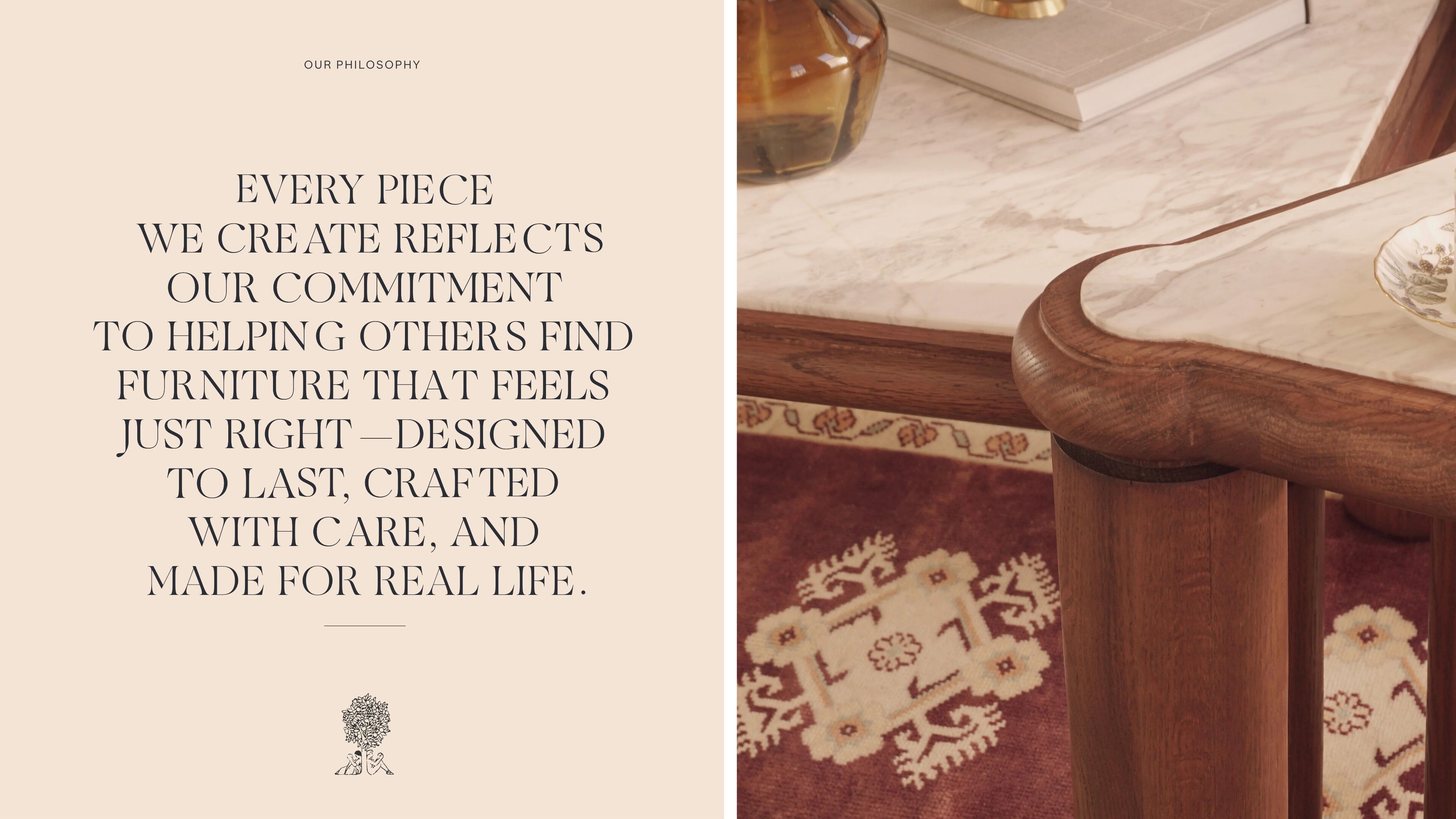
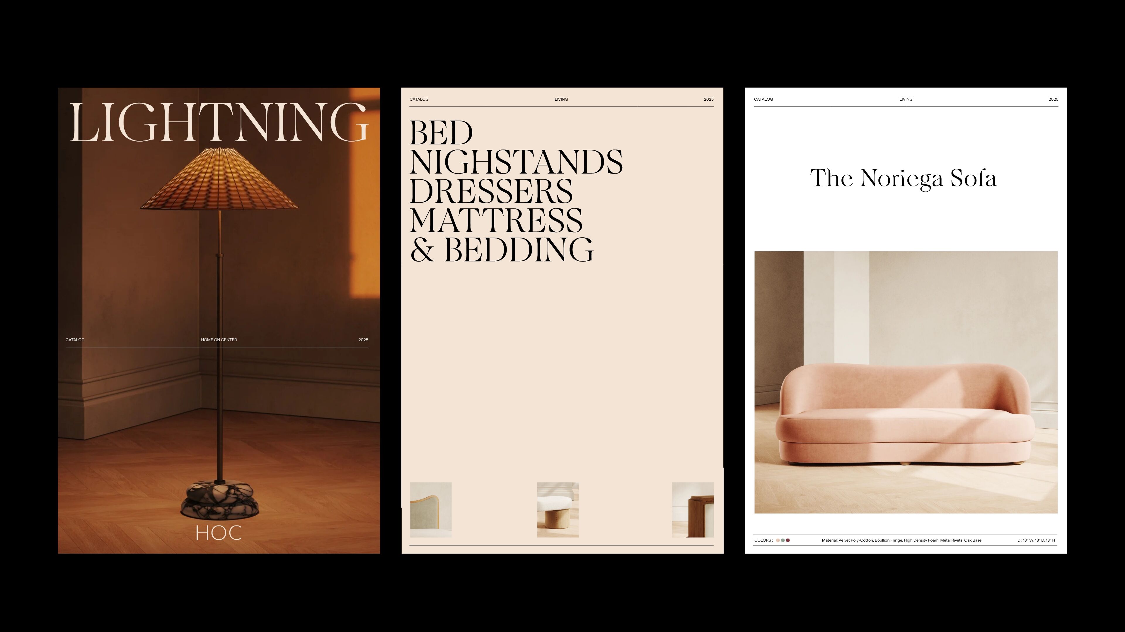
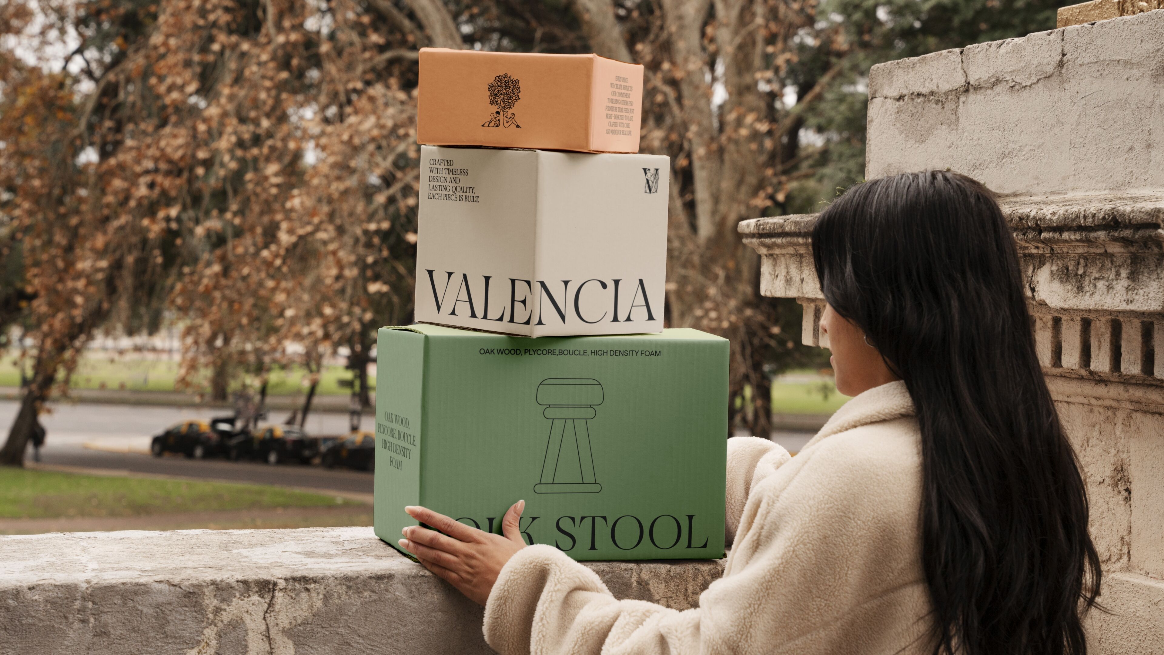
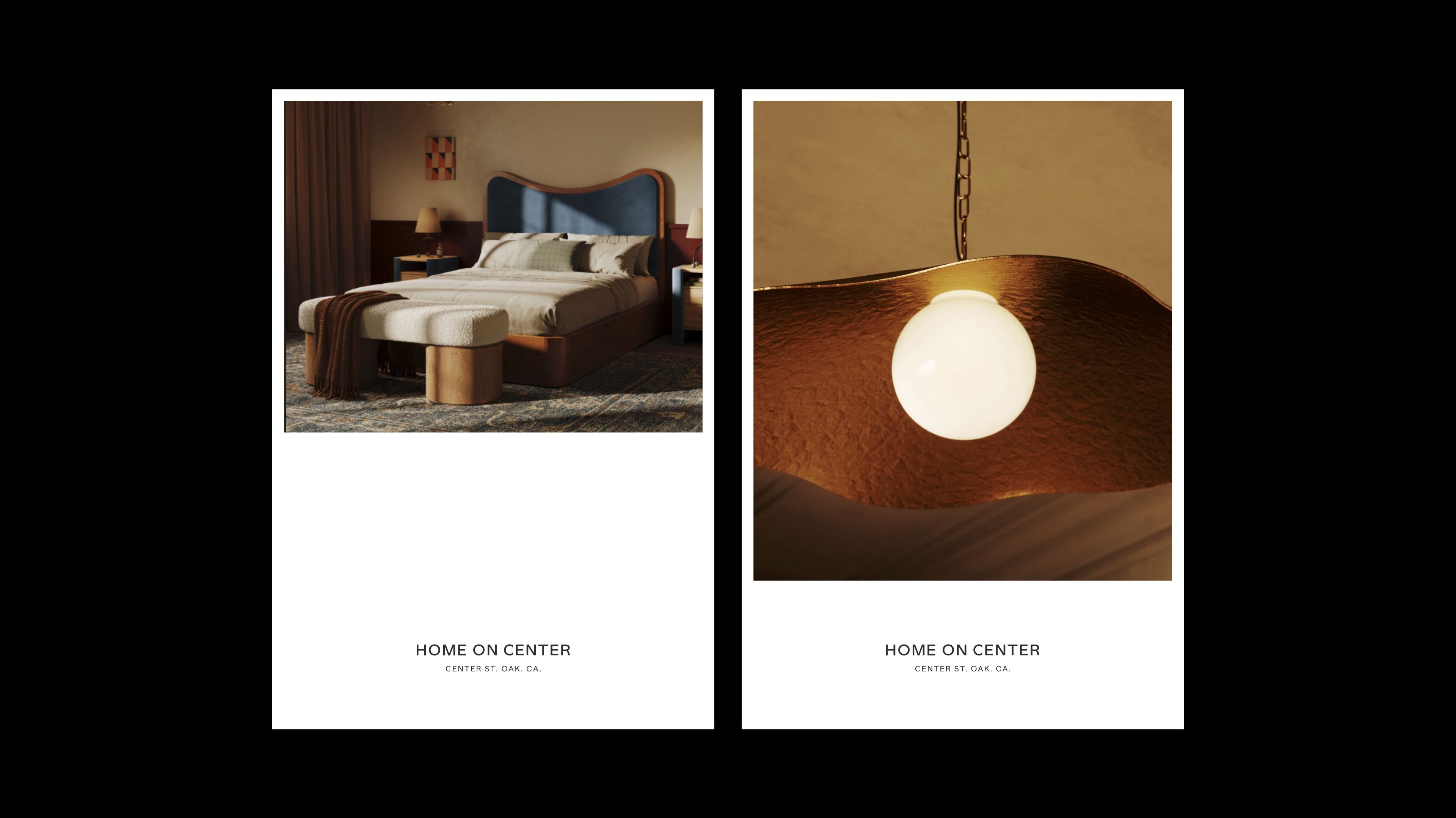
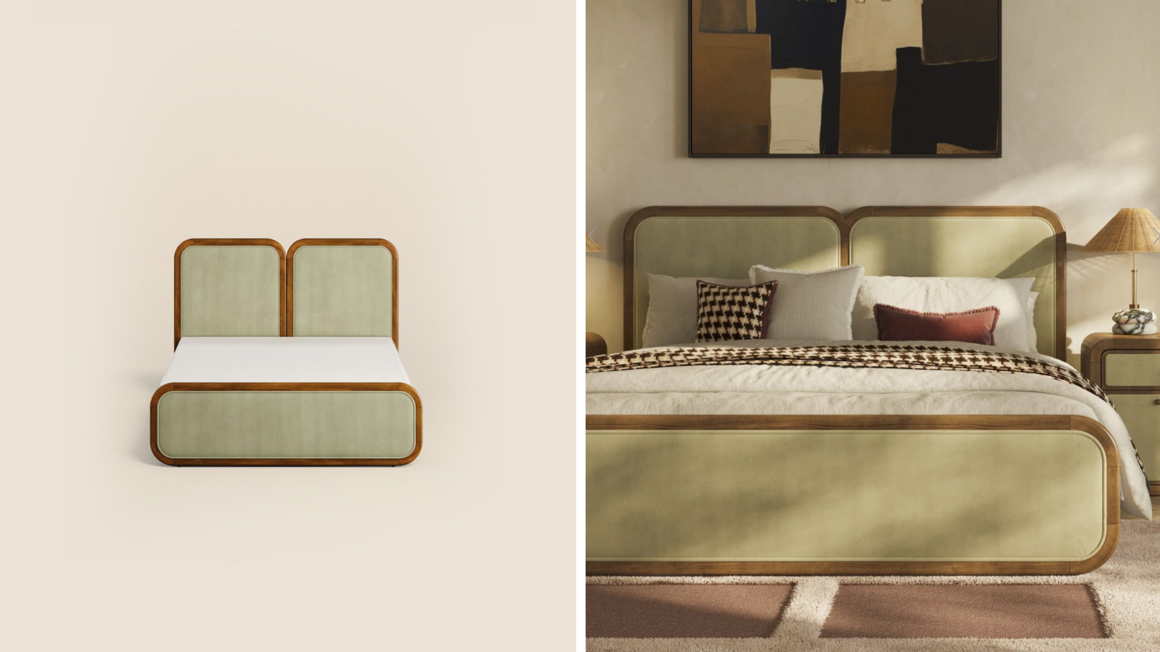
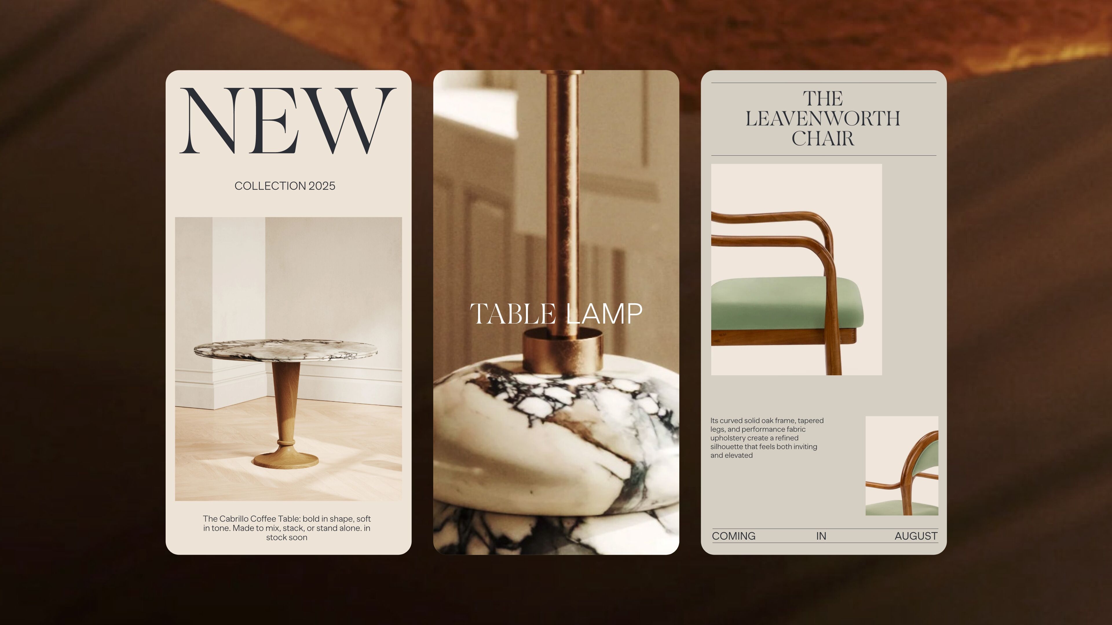
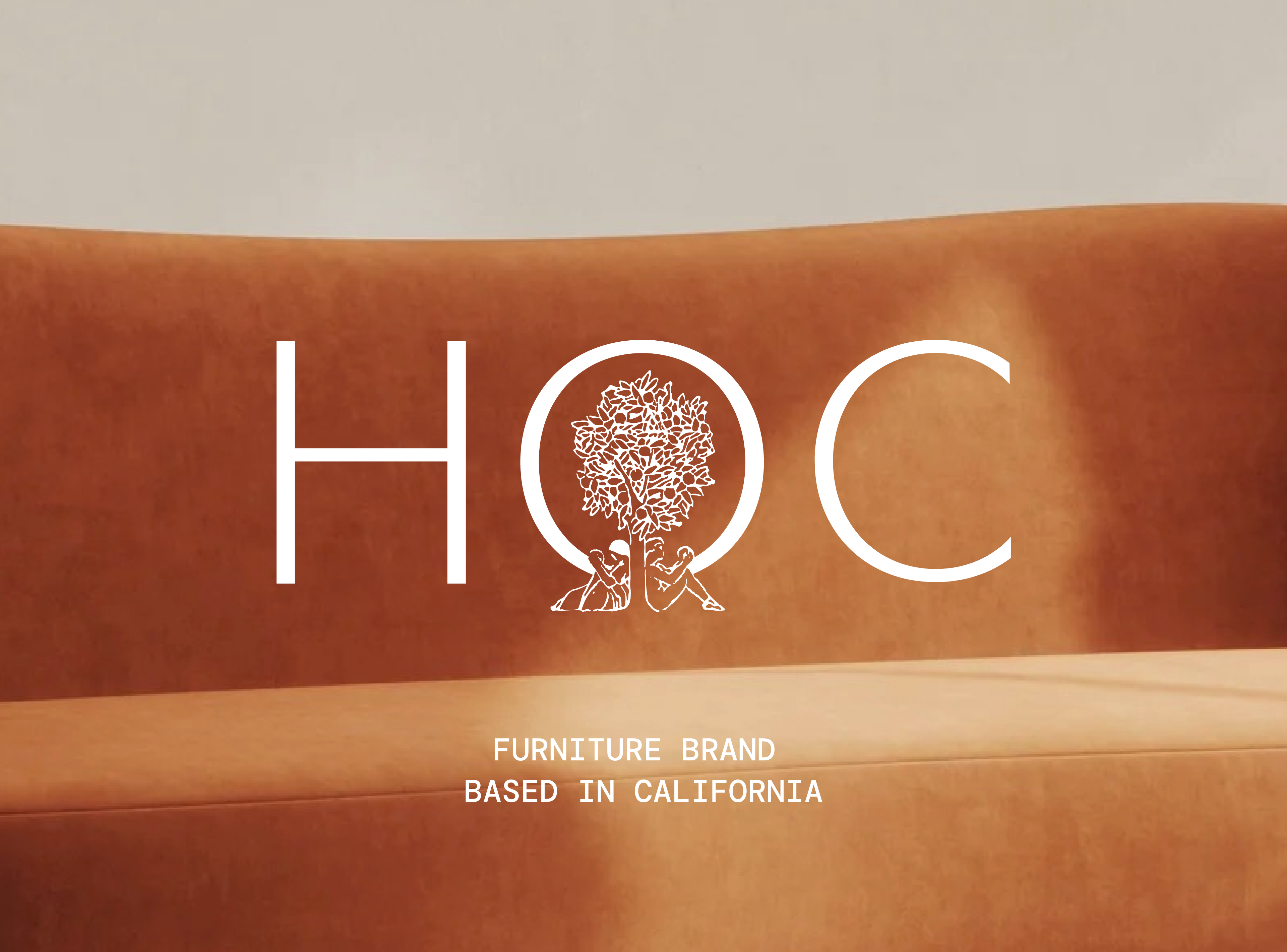
We partnered with Home On Center (HOC), a California-based furniture studio, to create a visual identity that reflects its core values and distinctive style. HOC designs pieces with soul and intention, combining natural materials — solid wood, carved oak, raw linen, polished marble — with finishes made to last. Each object is produced in small series by skilled artisans, striking a delicate balance between beauty, function, and longevity.
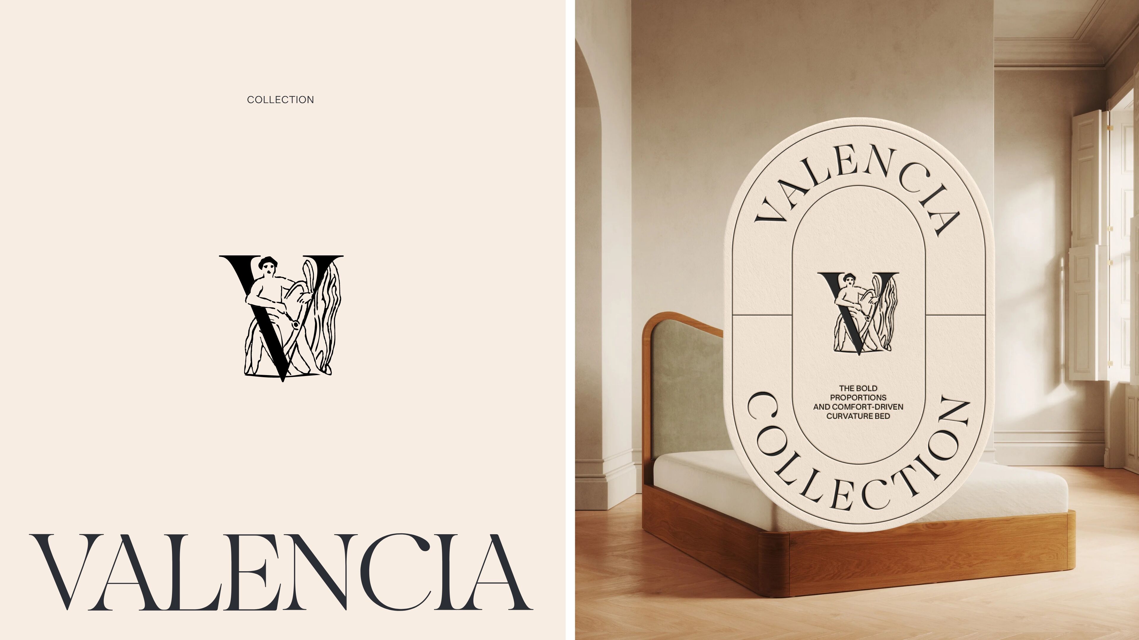
Our creative approach drew directly from the brand’s universe: the strength of raw materials, the warmth of craftsmanship, and the timeless elegance of form. We also found inspiration in the cultural heritage of the West Coast: San Francisco artists Arthur F. Mathews (1860–1945) and Lucia K. Mathews (1870–1955), pioneers of the California Decorative Style, created murals, paintings, furniture, graphics, wooden frames, and other works that left a lasting mark on their era. The brand’s graphic territory is freely inspired by their illustrated alphabet — now in the public domain — which perfectly embodies the artistic and inspiring Californian spirit of Home On Center.
This inspiration guided us in translating their vision into a tangible visual language:
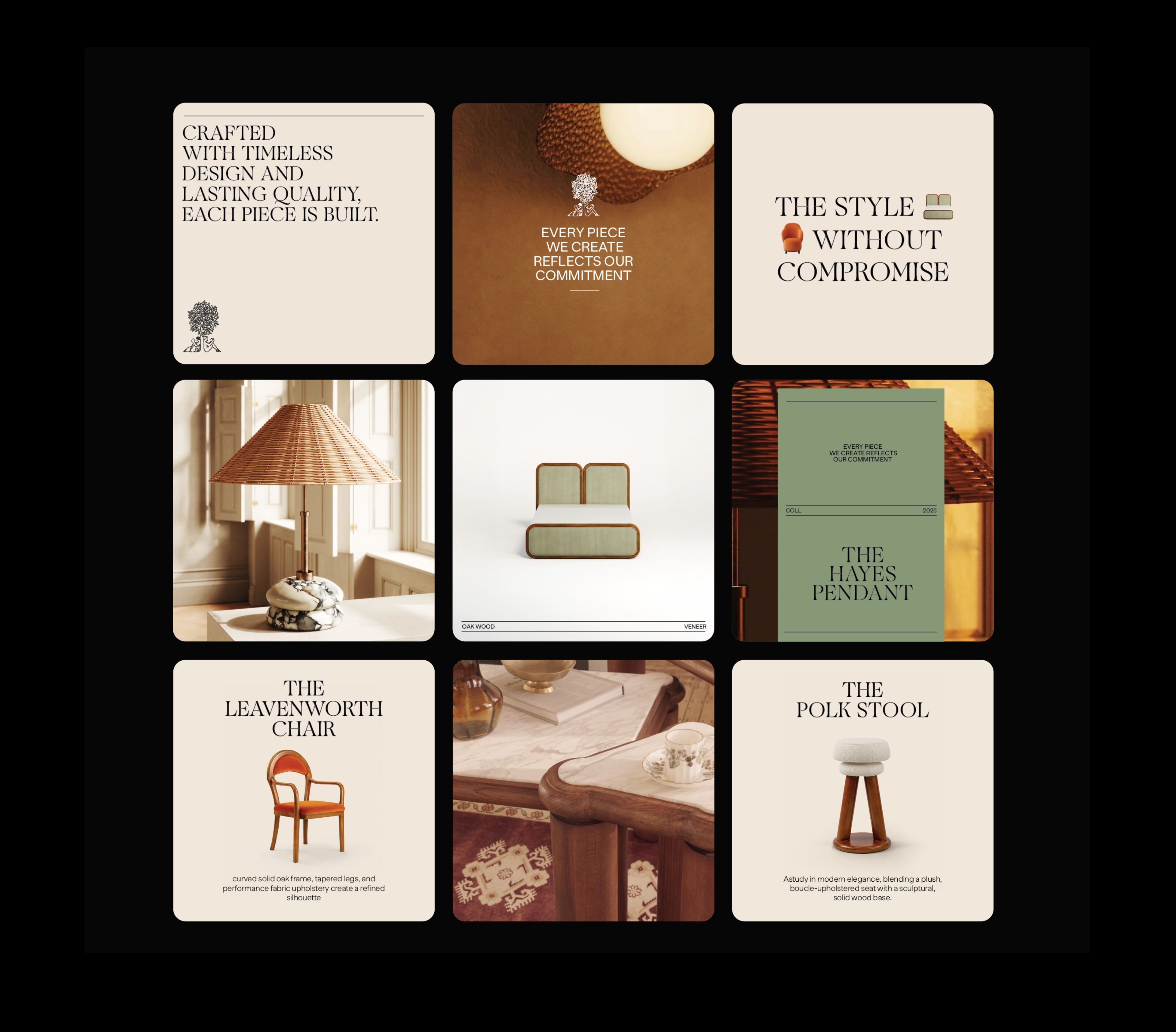
– A graphic signature that embodies their credo “Style Without Compromise”
– A central tree symbol, evoking roots, connection, and continuity
– A palette of natural and warm tones (Sand, Beige, Olive, Mahogany), resonating with nature
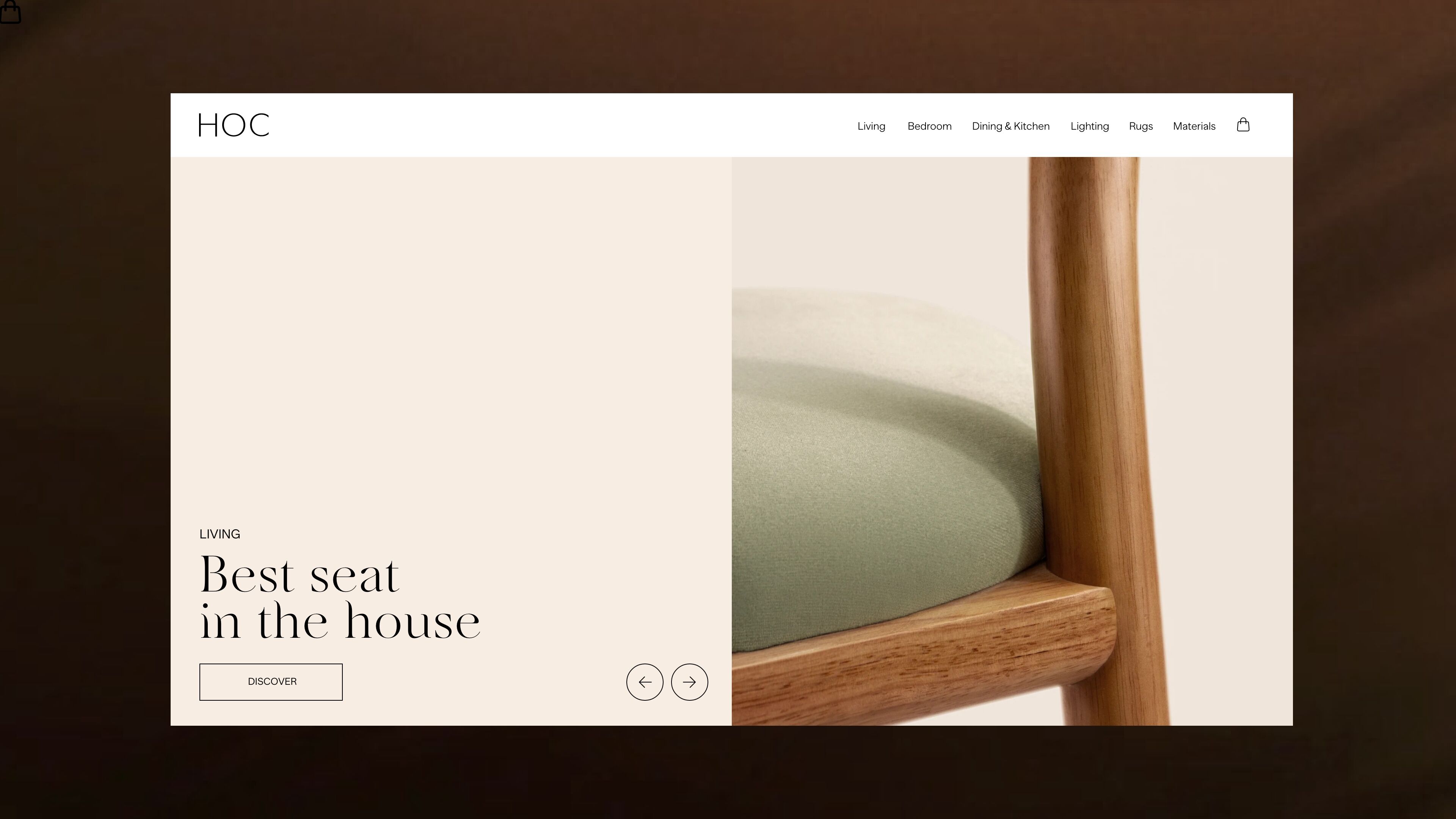
– A refined mix of serif and sans serif typefaces, balancing tradition and modernity


Hine Cognac - Rebranding